Data Visualization
ERASMUS Flow Map
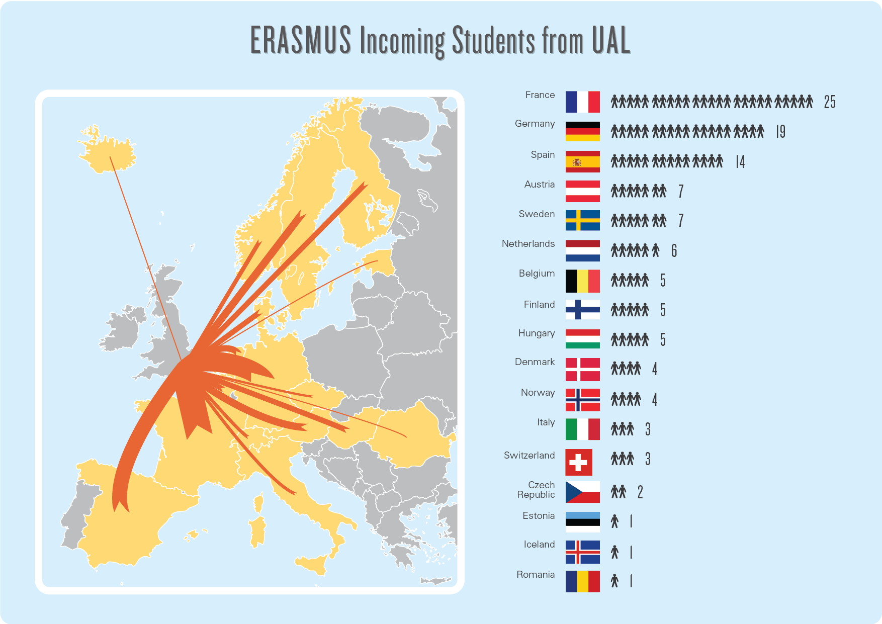
This infographic was used as internal communication material for a UK university to show where students were coming in and out through the ERASMUS program.

Client Name
University of the Arts London
Role
Designer
This infographic was used as internal communication material for a UK university to show where students were coming in and out through the ERASMUS program.
University of the Arts London
Designer